Why Your Website Gets Traffic but No Enquiries
Introduction
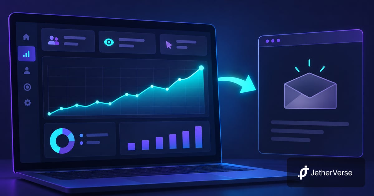
Imagine opening your analytics dashboard on Monday morning. Visitors are arriving, the traffic graph is climbing, and your website seems busy. Yet your inbox is quiet. No consultation requests, no quote enquiries, and no clear sign that people are becoming customers. If you are seeing website traffic but no leads, the problem is often not the number of visitors. It is the journey between landing on your page and deciding to contact you.
This guide explains the common causes, how to diagnose them without guessing, and how to improve website conversions with a practical plan you can start this week.
Why Website Traffic but No Leads Happens
Traffic measures visits, not buying intent or confidence. Someone reading an educational article may be researching a problem rather than looking for a provider today. Someone ready to buy may leave if the next step is confusing.
Effective lead generation requires three things to work together: the right audience, a convincing offer, and an easy path to action. A weakness in any one of them can leave a busy website with an empty inbox.
Start by separating your pages into informational pages, service pages, and contact or booking pages. Each has a different job. A blog post should guide qualified readers toward a relevant service; a service page should explain the offer and make contacting you simple.
Your Offer and Calls to Action Are Not Clear
Visitors should understand who you help, what you provide, and what happens next without searching through several pages. A headline like “Solutions for Tomorrow” sounds polished but says little about the actual service. A clearer alternative explains the outcome and audience, such as “Website design for service businesses that need more qualified enquiries.”
Calls to action, or CTAs, are the buttons and links that tell visitors what to do next. Generic labels like “Learn More” can be useful for exploration, but they are weak when a buyer is ready to enquire. Use action-specific language such as “Request a conversion review” or “Discuss your project.”
Place the primary CTA near the top of each important service page, repeat it after relevant proof or explanations, and keep the wording consistent. On mobile, check whether the CTA is visible without being buried under menus or decorative elements.
Do not give every button equal prominence. A page asking visitors to book, subscribe, download, and follow social accounts at the same time creates competing choices. Choose one primary next step and keep secondary actions quieter.
Slow Mobile Pages and Difficult Forms
A site may look excellent on a large desktop monitor and still frustrate someone using a phone. Heavy images, shifting elements, tiny tap targets, intrusive overlays, and slow-loading scripts make it harder to reach a form. Test real mobile pages, not only the homepage.
Google's Core Web Vitals guidance explains how loading, responsiveness, and visual stability affect the user experience. Use PageSpeed Insights to inspect important pages and prioritize issues that affect real visitors.
Forms deserve the same attention. Ask only for information you need to respond: often a name, a way to reply, and a short description of the request. If a form demands a detailed budget, full address, and multiple optional selections before a simple conversation, people may abandon it.
Test submission on a phone using both valid and invalid inputs. Confirm that errors are understandable, the submit button works, a success message appears, and the enquiry actually reaches the intended inbox or CRM. A form that looks successful but fails silently is especially costly.
Trust Signals and Traffic Intent
People hesitate when they cannot tell whether a business is credible. Helpful trust signals include a clear business identity, specific service descriptions, genuine portfolio work, verified reviews where available, accessible contact details, and transparent expectations about the process.
Never invent testimonials, client logos, performance claims, or project results. Real examples with a clear explanation of the problem and work completed are more persuasive than exaggerated promises.
Also check why visitors arrived. A search for “what is conversion optimisation” signals a different stage of intent from “hire a UI UX designer.” Both audiences can matter, but they need different landing pages and calls to action.
Review search queries in Google Search Console, along with advertising search terms where applicable. If visitors arrive for information unrelated to your service, improve targeting and internal links before redesigning every page. The aim is qualified interest, not traffic for its own sake.
Track Enquiries Before You Change the Design
Without reliable measurement, you cannot tell whether the issue is low intent, a confusing page, or a broken form. Define a lead event clearly: for example, a confirmed contact form submission or a completed booking. Clicking a button is useful supporting data, but it is not the same as receiving an enquiry.
In Google Analytics event measurement, events can represent important interactions. Configure a successful form submission as a meaningful event only after the server or form provider confirms success. Avoid counting failed attempts or page views as leads.
Build a simple journey report: landing page, service page visit, CTA click, form start, form success, and qualified enquiry. Check each event in a test session, and compare recorded submissions against the actual inbox or CRM.
Respect consent and privacy requirements when configuring analytics. Avoid sending names, email addresses, or message contents as event parameters. For small traffic volumes, examine individual patterns carefully rather than treating every percentage change as proof.
Diagnosis Checklist: Symptom, Cause and Fix
Use this table as a starting point, not a substitute for testing. Several issues can occur at once.
| Symptom | Likely cause | Fix |
|---|---|---|
| Visitors leave service pages quickly | Offer or audience mismatch | Clarify who the service is for and its outcome |
| CTA rarely clicked | Hidden or vague next step | Place a clear action near the offer |
| Many mobile exits | Slow or difficult mobile experience | Test speed, layout and tap targets |
| Form starts but few completions | Too many fields or confusing errors | Simplify and test the form |
| Form success but no inbox messages | Delivery or integration failure | Test notifications and CRM routing |
| High blog traffic, few leads | Mostly informational search intent | Link relevant articles to matching services |
| Enquiries arrive but analytics shows none | Missing success event tracking | Track verified submissions |
A Practical Conversion Improvement Plan for This Week
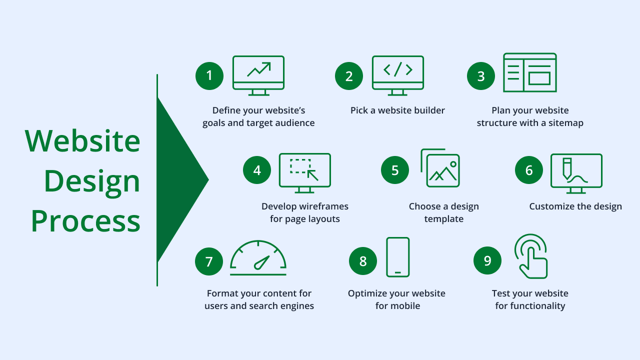
You do not need a complete redesign to begin improving lead generation. Work through this sequence and document what changes.
Day one: define what counts as a qualified enquiry, verify that forms deliver messages, and confirm that analytics records successful submissions. Fix broken measurement before interpreting conversion rates.
Day two: identify the service and landing pages attracting relevant visitors. Compare their headlines, audience promises, and next steps against the search terms or campaigns sending traffic.
Day three: test those pages on real phones. Check load speed, layout stability, CTA visibility, form usability, and whether confirmation messages are clear.
Day four: rewrite one unclear offer and strengthen one primary CTA. Reduce unnecessary form fields and add authentic evidence near the point where visitors make a decision.
Day five: publish the improvements, document the changes, and check the entire journey again. Over the following weeks, compare qualified enquiries with relevant visits and investigate changes in traffic quality.
Prioritize fixes using impact, confidence, and effort. A broken form is urgent because it blocks every submission. A confusing headline is worth testing. A decorative animation is usually a lower priority unless it harms usability. Change a manageable number of elements so you can understand what happened.
For an ongoing process, use conversion optimisation: observe behaviour, identify friction, propose a fix, measure the outcome, and repeat. Avoid claiming that a single visual change caused more sales unless your measurement supports it.
Frequently Asked Questions
Why does my website get traffic but no enquiries?
Usually the audience, offer, trust, mobile experience, CTA, or contact process is misaligned. Verify form delivery and tracking before deciding which issue matters most.
How do I convert website visitors into leads?
Make the offer specific, match each page to visitor intent, show credible evidence, and offer a simple next step. Measure confirmed enquiries rather than clicks alone.
Why are website visitors not filling out contact forms?
Forms may be hard to find, too long, confusing, or broken on mobile. Test the form yourself and remove fields that are not necessary for an initial response.
Should I buy more traffic if my website is not converting?
First confirm that existing qualified visitors can enquire successfully. Increasing traffic to a broken or unclear journey can increase costs without solving the underlying issue.
How do I know if my contact form tracking works?
Submit a test enquiry, verify it reaches the inbox or CRM, and confirm that the successful submission appears as the intended analytics event.
Does conversion optimisation require a full website rebuild?
Not always. Clearer copy, better CTA placement, mobile fixes, and reliable forms may be sufficient. Consider a rebuild when the underlying platform prevents essential improvements.
Conclusion
A rising visitor count is encouraging, but it is only one part of business performance. When your website gets traffic without enquiries, examine the offer, visitor intent, mobile experience, trust signals, contact process, and tracking together.
Start with the problems that prevent people from contacting you at all. Then improve clarity and relevance, measure genuine enquiries, and keep refining the journey. Better website conversions come from making the next step easier for the right people, not simply making the traffic graph taller.
How JetherVerse Can Help
JetherVerse combines UI/UX design and analytics to identify where potential clients get stuck and improve the path from first visit to qualified enquiry. Request a conversion review to understand which pages and interactions deserve attention first.
What we offer:
- UI/UX audits of key landing and service pages
- Conversion journey and funnel analysis
- Mobile usability and accessibility improvements
- Contact form testing and optimisation
- Analytics event and enquiry tracking setup
- CTA and landing page design improvements
Book a free consultation: cal.com/jetherverse or reach us through our contact page.
- 📧 Email: info@jetherverse.com
- 📞 Phone: +234 915 983 1034
- 🌐 Website: jetherverse.com