Logo vs Brand Identity: What Your Business Actually Needs
Introduction
A founder opens a new online shop. She pays a freelancer for a logo, uploads the file to her website and prints business cards. Three months later, her Instagram looks different from her website, her packaging uses another shade of blue, and her invoices carry a fourth font. Customers cannot tell the pages belong to one business. She has a logo, but she does not have a brand identity.
This guide explains the logo vs brand identity question in plain terms. You will learn what each one is, what a brand identity package includes, how the two differ in cost and effort, and how to decide which one your business needs today. You will also get a checklist and a decision framework to use before you hire a designer.
What Is a Logo?
A logo is a single mark used to identify a business. Most logos are a symbol, a wordmark (the name in a styled typeface), or a combination of both. A logo works like a signature. Customers see the mark on a sign, a website header or a product label and link the mark to your company.
A good logo is simple, readable at small sizes and distinct from competitors. Good logos also work in one colour, on light and dark backgrounds, and in a square format for social media profile pictures.
A logo answers one question: who is this? Nothing more. A logo does not tell designers which colours to use on a brochure, how to write a headline or how photos should look.
What Is a Brand Identity?
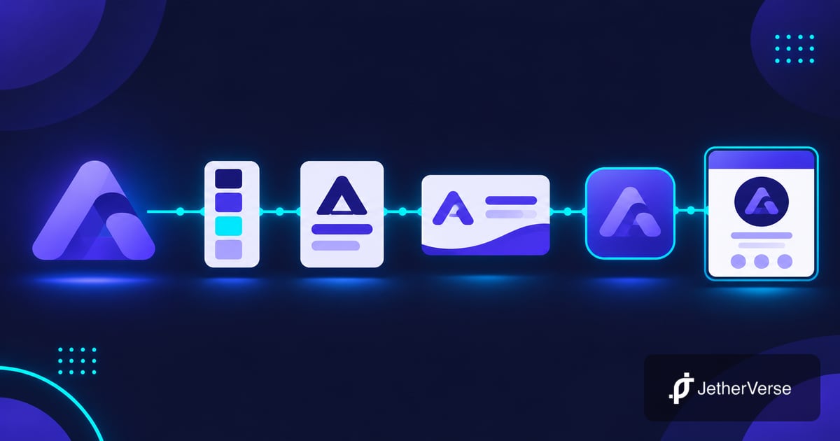
Brand identity is the full set of visible and verbal elements which represent your business. The logo is one part. The system around the logo makes every touchpoint look and sound consistent.
A visual identity covers the look of the brand. A verbal identity covers the way the brand speaks. Together they form one identity. Customers do not read a style guide, but they feel the result. A consistent identity builds recognition, and recognition builds trust over time.
Logo vs Brand Identity: The Core Differences
The logo vs brand identity gap comes down to scope. A logo is one asset. A brand identity is a system of assets plus the rules for using them. The table below shows the difference.
| Area | Logo only | Full brand identity |
|---|---|---|
| Scope | One mark in a few file formats | Logo, colours, type, imagery, voice and usage rules |
| Consistency | Depends on who builds each page or print job | Guidelines keep every channel aligned |
| Team use | Staff and freelancers guess | Anyone follows the guide |
| Cost and time | Lower and faster | Higher and slower, with more rounds of review |
| Best for | Early tests and side projects | Businesses ready to grow across several channels |
What a Brand Identity Package Includes
People often ask what a brand identity package includes. Scope differs between designers, but a solid package covers the items below.
Logo suite
A primary logo, a secondary or stacked version, a small icon for profile pictures and favicons, and one-colour versions. Files arrive in vector and web formats.
Colour palette
A main colour, supporting colours and neutrals, each with exact values for screen and print. Palettes should pass contrast checks. The WCAG contrast guidance gives the minimum contrast between text and background, which protects readability for all users.
Typography
One typeface for headings, one for body text and rules for size and spacing. Licences matter here, so confirm you are allowed to use each font on web and print.
Imagery and graphic style
Direction for photos, illustration, icons and patterns. For example, a bakery might choose warm natural light and close crops, while a software firm might choose flat illustration and clean grids.
Voice and messaging
A short description of how the brand writes: formal or relaxed, short or detailed. This section often includes a tagline, a one-line description and sample headlines.
Brand guidelines and templates
A document showing spacing around the logo, misuse examples and colour ratios. Many packages add templates for social posts, slides, email signatures, invoices and business cards.
Signs You Only Need a Logo
A logo alone is a fair choice in some cases.
- You are testing an idea and have not yet found customers.
- You run a personal project or side business with a small budget.
- You sell in one channel only and control every page yourself.
- You expect to rebrand within a year as the offer takes shape.
Even here, ask your designer for the logo in several formats and one-colour versions. Choose two brand colours and one font on day one, and write them down. This costs nothing and avoids drift.
Signs You Need a Full Brand Identity
Move to a full identity when you see these signals.
- Your website, social pages, packaging and documents look unrelated.
- More than one person creates marketing material.
- You plan to raise prices, enter new markets or launch new products.
- You compete with larger firms and need to look established.
- You are about to build or redesign a website, since the design needs clear colours, type and imagery rules.
Our branding and graphic design service covers the whole set, from logo to guidelines, so the pieces fit together from the start.
How Brand Identity Affects Your Website and Marketing
A website turns an identity into hundreds of small decisions: button colours, heading sizes, photo crops and the tone of each page. Without rules, each decision gets made again and results drift. With rules, a designer or developer builds faster and the site feels consistent.
Digital design systems work the same way. Large design systems such as Material Design colour guidance show how a defined palette with clear roles keeps interfaces coherent. A small business does not need a huge system, but the principle holds: define once, reuse everywhere.
Marketing also gets cheaper. Ad creative, email layouts and social templates reuse the same parts, so new campaigns need less design time.
Common Mistakes When Choosing Between a Logo and a Brand Identity
Paying for a logo and expecting a system
A logo file does not tell your web developer which blue to use or how large a heading should be. Owners who expect a logo to solve consistency end up paying twice: once for the logo, again for the rules which were missing.
Copying a competitor's look
Borrowing colours and shapes from a rival makes your business easy to confuse with theirs. A brand identity works when customers tell you apart at a glance, so study competitors to find the gaps rather than to copy.
Following trends over fit
A fashionable style looks dated within a few years. Choose colours, type and imagery based on your audience and your offer. A calm, clear identity ages better than a loud one.
Skipping the guidelines
Guidelines look like extra paper, but they save time. A new team member, a printer or an agency reads one document and gets the result right the first time. Without the document, each person guesses and the look drifts.
Ignoring accessibility
Pale text on a light background looks elegant on a design file and fails on a phone in daylight. Test colour pairs early, since changing a palette after launch means updating every asset.
A Simple Example
For example, consider a small skincare brand which starts with a logo only. The owner picks a soft green for the website, a different green on labels and a third on social posts. Customers who see an ad and then open the website pause for a moment because the two do not match.
After building a core identity, the brand defines one main green, two supporting shades, one heading font and one body font. Label printers, the web developer and the social media manager all use the same file. The shop looks like one business, and new products launch with less design work. This is a hypothetical case, but the pattern appears in many growing businesses.
A Decision Framework: Logo or Full Identity?
Answer each question with yes or no.
- Do you sell through three or more channels (website, social, print, packaging)?
- Does more than one person produce material for the business?
- Do you plan to grow in the next twelve months?
- Do customers compare you with established competitors?
- Do you plan a new or redesigned website?
Score yourself. Zero or one yes: start with a logo and a simple style sheet. Two or three yes: choose a core identity with logo suite, colours, type and basic guidelines. Four or five yes: invest in a full identity with templates and voice.
Checklist Before You Hire a Designer
- Write one paragraph on who your customers are and what they value.
- List three competitors and note what you like and dislike about their look.
- Collect examples of designs you admire, with a note on why.
- Decide where the brand appears first: website, packaging, social or print.
- Agree on deliverables in writing, including file formats and number of review rounds.
- Confirm who owns the final files and font licences.
- Ask for brand guidelines, not only logo files.
Frequently Asked Questions
What is the difference between a logo and a brand identity?
A logo is one mark. A brand identity is the full system of logo, colours, typography, imagery, voice and rules for using them across every channel.
Do I need a full brand identity or only a logo?
Early tests and small side projects work with a logo. Growing businesses with several channels or several team members benefit from a full identity. Use the decision framework above to check your case.
How long does a brand identity project take?
Time depends on scope and review speed. A simple identity often takes a few weeks, and a larger one takes longer. Quick feedback from you shortens the schedule more than any other factor.
Is brand identity the same as branding?
No. Brand identity is the set of assets you control. Branding is the wider work of shaping how customers see your business, which includes service, pricing, reviews and everything customers experience.
Should I rebrand if I already have a logo?
Not always. If your logo works, keep the mark and build the missing parts around the logo: colours, type, imagery and guidelines. Refresh the logo only when the mark looks dated, reads poorly at small sizes or no longer fits your offer.
Conclusion
A logo tells customers who you are. A brand identity tells customers what to expect, every time they meet your business. Both matter, but they solve different problems.
If you are testing an idea, start with a clean logo and write down two colours and one font. If you are ready to grow, build the system early. Fixing a scattered look later costs more than planning a clear one now.
How JetherVerse Can Help
JetherVerse designs brand identities for businesses worldwide, from a first logo to a complete system. Our branding and graphic design service keeps your logo, website, social pages and print material aligned.
What we offer:
- Logo design and logo suites in all formats
- Colour palettes and typography selection
- Brand guidelines and usage rules
- Social media, email and presentation templates
- Packaging and print design
- Website design built on your brand identity
Book a brand consultation to review your current look and get a clear recommendation.
Book a free consultation: cal.com/jetherverse or reach us through our contact page.
- 📧 Email: info@jetherverse.com
- 📞 Phone: +234 915 983 1034
- 🌐 Website: jetherverse.com